Colors in Balance: Create Depth and Life in Your Space with Contrasts and Shades

Colors in Balance: Create Depth and Life in Your Space with Contrasts and Shades
Color is more than decoration – it shapes atmosphere, influences mood, and can make a room feel larger, cozier, or more harmonious. When you work intentionally with contrasts and shades, you can create a home that feels both vibrant and balanced. Here’s how to use color strategically to bring depth and personality to your space.
Understanding How Colors Interact
Colors never exist in isolation. A navy wall looks different next to warm oak than it does beside crisp white. Choosing colors isn’t just about finding a pretty hue – it’s about creating a cohesive composition.
- Contrasts bring energy and movement. Think dark versus light, warm versus cool, matte versus glossy.
- Shades create calm and unity. When you layer multiple tones of the same color, you achieve a soft, natural flow.
A simple starting point is to choose one dominant color, one secondary color, and one accent color. The dominant color sets the foundation, while the others add rhythm and balance.
Creating Depth with Contrasts
A room without contrast can feel flat. By pairing light and dark elements, you introduce dimension and structure.
Try painting the walls in a rich, saturated tone while keeping the ceiling and trim light – it adds character without overwhelming the space. Or use dark furniture against pale walls to anchor the room visually.
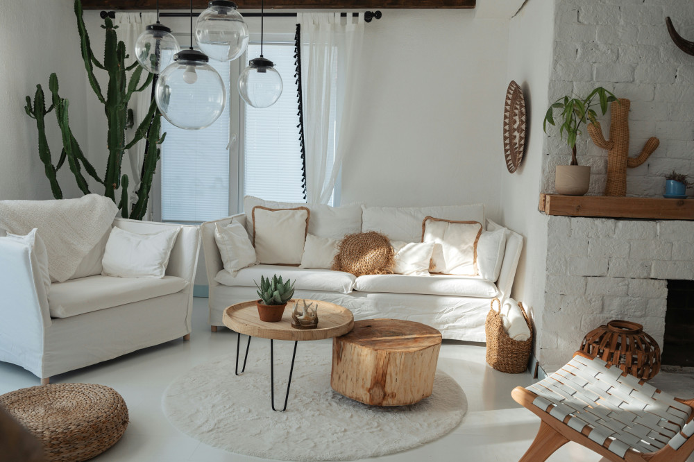
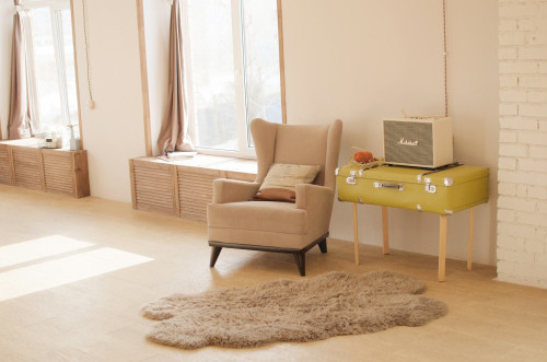
Contrast isn’t limited to color. Texture plays a key role too: a rough brick wall beside a smooth surface, or a plush rug on a sleek hardwood floor, creates visual interest and tactile depth.
Shades That Bring Harmony
While contrast energizes, shades soothe. Working with several tones of the same color produces an elegant, balanced look.
For example, layer soft greens or blues in varying intensities – from wall color to textiles and accessories. The result is cohesive yet dynamic.
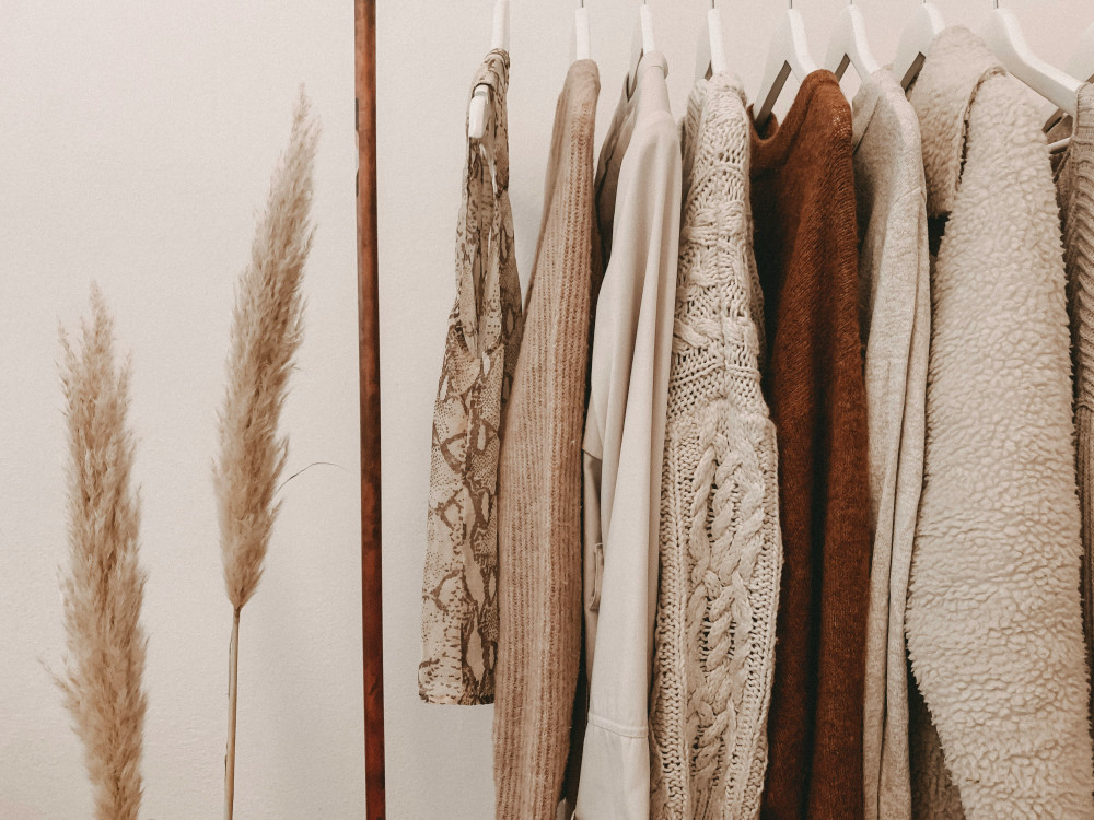
Nature is a great teacher here. Think of the subtle variations in a forest’s greens, the ocean’s blues, or the desert’s warm neutrals – they show how shades naturally coexist in harmony.
Light – The Hidden Color Factor
Light changes everything. A color that looks warm and golden in daylight can appear cool under artificial light. Always test paint samples in the actual room and observe them at different times of day.
Rooms with northern exposure often benefit from warm tones like ochre, terracotta, or blush, while sun-filled southern rooms can handle cooler hues such as slate blue or sage green.
Also consider how your lighting fixtures affect color. Warm bulbs enhance coziness, while cooler light gives a crisp, modern feel.
Colors with Personality
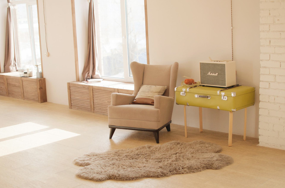
Color is a form of self-expression. A home with personality embraces contrast – not just in color, but in mood. Combine timeless neutrals with a bold pop: a mustard-yellow chair, a deep-blue door, or a vibrant piece of art.
If you’re hesitant, start small. Paint a single wall, refresh a piece of furniture, or introduce color through pillows and decor. This lets you experiment without major commitment.
Finding the Right Balance
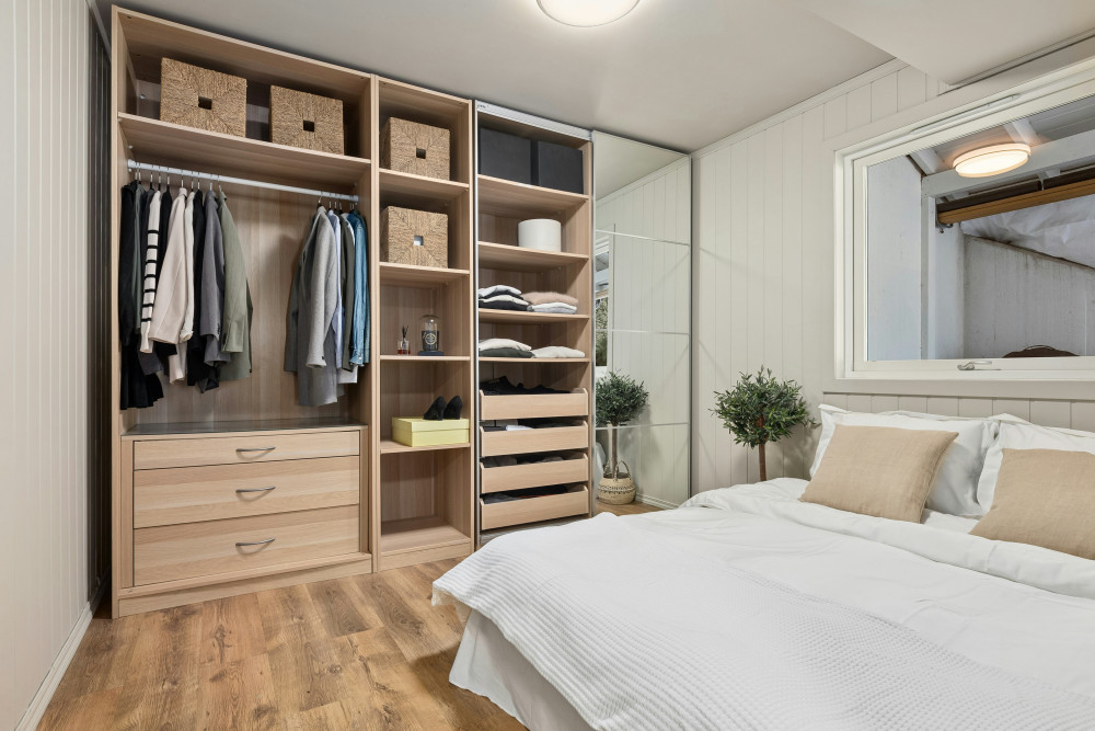
Balance happens when contrasts and shades work together. Too many bold colors can feel chaotic, while too many neutrals can seem dull.
A helpful guideline is the 60-30-10 rule:
- 60% of the room in a dominant color (walls and large surfaces)
- 30% in a secondary color (furniture and textiles)
- 10% in an accent color (art, accessories, and details)
This ratio ensures harmony, allowing colors to complement rather than compete.
Læs også:

A Home with Life and Calm
Working with color isn’t about following trends – it’s about creating an environment that feels right for you. A balanced space has both serenity and vitality; it invites you to relax yet keeps your senses engaged.
Color can transform a room instantly. It can calm, uplift, or focus the mind. By understanding how contrasts and shades interact, you can design a home that feels both harmonious and alive – a place where you truly feel at ease every day.
Læs også: